
Build Your Visual Style DNA: How to Make Every AI Image Look Like Your Brand
Scroll back through the last thirty images you made.
Be honest. Do they look like they came from one brand, or do they look like thirty different people took a turn at the keyboard? Most creators land on the second answer, and it’s not a talent problem. It’s a system problem.
Here’s what happens. You get excited about a prompt. It works. You post it. Then tomorrow you’re in a different mood, so you try a different look, and that one works too. A month later your feed is a pile of individually decent images that add up to nothing. Nobody recognizes your work when it shows up in their feed, because there’s nothing consistent to recognize.
That’s the gap your visual style DNA closes.
Style DNA is the set of decisions you make once, before you generate anything, that every image after that has to answer to. Three parts: personality, message, and feel. Personality is who your brand acts like. Message is what the visual is supposed to make someone understand. Feel is the emotional temperature: warm and human, sharp and technical, playful, quiet, bold. Lock those three and you stop starting from zero every time you open Midjourney.
Most people skip straight to prompting because prompting feels like progress. Deciding feels like homework.
But deciding is the work.
Start with personality, and get specific enough to be useful. “Professional” isn’t a decision. “A friendly expert who’s already made the mistakes and wants to save you time” is a decision, and you can actually see what that looks like. It looks like people in the frame instead of abstract shapes. It looks like real textures instead of glossy perfection. Write your personality in one sentence you’d be willing to say out loud, then keep it where you can see it.
Then handle the visual specifics, because personality alone won’t render.
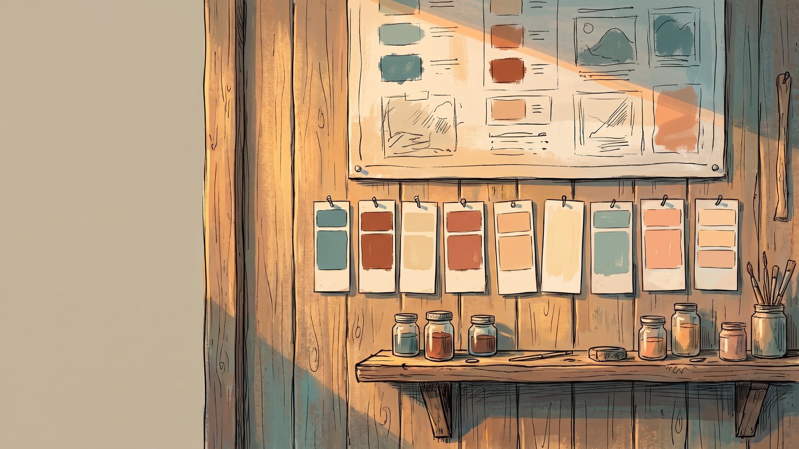
Pick your color system and commit. Mine leans high-contrast teals, deep blues, emerald greens, and charcoal, with a bright mint accent that glows. That’s not a mood board I revisit every week. It’s a decision I made and now reuse. Two or three anchor colors plus one accent is plenty. More than that and you’ve built a rainbow instead of a signature.
Pick your art style with the same commitment. Graphic novel. Marvel-style comic. Layered paper cut. 3D animated feature look. Any of these can carry a serious brand, and any of them beat a random mix of five styles. If you can’t name your style in three words, you don’t have one yet.
Pick your lighting and mood too, because that’s where most inconsistency hides. Soft ambient light and hard directional light will make the same subject in the same colors feel like two unrelated brands.
Now the part that separates a style guide from a style DNA: every visual needs a job.
Pretty isn’t a job. A job sounds like “make this offer easier to understand,” or “make this concept feel less intimidating,” or “make somebody stop and read the first line.” Before you generate, say out loud what this image has to accomplish. If you can’t say it, you’re decorating, and decoration is where budgets and hours go to die.
The standard isn’t whether the image looks good. It’s whether the image makes your brand clearer, more memorable, and more marketable.
Once your style DNA exists, it becomes a system instead of a vibe. The same three-part definition drives your branded social graphics, your slide decks, your lead magnet covers, your Pinterest pins, your merch designs, and your story-driven video stills. One decision set, many outputs. That’s what makes a small operation look organized and a solo creator look like a studio.
Here’s how you test it. Generate four images for four totally different topics using your style DNA as the base. Put them side by side. If a stranger could tell they came from the same brand without seeing your name, your DNA is holding. If they can’t, something in your definition is still too vague, and it’s almost always the feel or the lighting.
Then write it down in plain language. Not in your head. In a document you can paste from. Personality sentence, three colors plus accent, named art style, lighting, mood, and the two or three subjects you return to most. That document becomes the front half of every prompt you write from now on.
You’ll also find your existing work already knows the answer. Pull your five favorite images you’ve ever made, the ones that feel like you, and study what they share. That’s not guesswork, that’s evidence. Look at the colors, the light, the level of detail, the camera distance, the amount of empty space. Write down what repeats. Nine times out of ten your style DNA has been sitting in your own gallery the whole time, undocumented, which is why you can’t reproduce it on demand.
Then do the same with images you love from other creators, but only to name the ingredients. You’re not copying the look. You’re building vocabulary so you can describe your own.
Consistency isn’t a personality trait. It’s a decision you made once and stopped renegotiating.
So pick your three parts today. Personality, message, feel. Write them down, generate four images across four unrelated topics, and look at them together. You’ll know within ten minutes whether your DNA is real or whether you’ve been improvising this whole time.
And if it’s the second one, that’s fine. That’s most people. Just move, and fix it before you make the next hundred images.
If you want help naming your three parts instead of guessing at them, Steal These Styles walks you through building a style you can actually repeat. You’ll leave with your own DNA written down, not a folder of images you can’t reproduce.
